Bjango My App Design Workflow
My Approach to UI Design
Introduction
![]()
First of all, this is somewhat of a rebound of what Marc Edwards from Bjango has written up for his app design workflow. This article will be a little bit more broad on UI design covering both web design and native app design. By the way, this is just my opinion on how to design for UIs, there are probably better ways to do all of these things. If you do have a better way, tell me in the comments below, I'm always interested in refining my workflow.
The Tools
I design with Photoshop
"Blasphemy!" , I hear you say. Look, I know there are specialised tools out there for UI design, but I'm of the opinion to use whatever works so long as the quality of the deliverable is not compromised. For me, Photoshop is the best tool. I can write scripts, create plugins, I know all of the keyboard shortcuts; in the end it gets shit done quicker and that's what I need in a tool. Granted, if or when Photoshop gets beaten out by another tool I'll gladly jump ship, but as of writing Photoshop is still king.

I animate with Pixate
If you haven't tried Pixate, you need to. Simply put, it's awesome. What I use it for is for the micro interactions. Where it falls short is the navigation between screens.
I prototype with Marvel
Because of Pixate's shortcomings, Marvel is a great tool to pick up the slack. It integrates with Dropbox and gets the macro interaction of a project down. The way I use it is I have Photoshop Generator export into a Dropbox folder and then import the JPGs into the Marvel project I'm working on. The best thing about this is, I just need to save the PSD and everything gets updated on the fly.
The Process
I research the problem
I define the problem, research solutions, wireframe and iterate. Before I go too deep into my solution I make sure that the team that I'm working with has the same understanding of the problem and the project.
I involve developers
I've done a little web development before so I'm no stranger to code. I've even played around with native development. It's not my strong suit but I gain an appreciation of what it takes to make a product through code. I'm not suggesting you go out and learn to code, for some that would be dangerous, just be aware of what your development team goes through on a daily basis to carry out your design. If you have a developer telling you that they can't do "X", make sure you know why they can't do it. Make every problem into a chance for dialogue. Talk to your developers, they are human.
The Design Workflow
I design with the user workflow in mind
I wireframe the shit out of the user workflow. This brings a lot of the hard work to the forefront before I even touch Photoshop. I then chuck it into a master PSD that has all linked smart objects as snapshots of each screen I design. This is a good way to measure progress on the design of a project. I have a few stakeholders that I have to show my designs to on a regular basis. Communication is key. By showing off this master PSD, they can instantly see my progress, how long it takes to design a screen and I can adjust their expectations accordingly.
I design using a style guide
Over the last couple of months I've had a few extra hours a week to sit down and plan out a style guide for my current employer. Trying to bring consistency to quite a few projects that have been going for a couple of decades is no easy task, but someone's got to do it. This style guide will eventually have all my design elements, patterns, icon fonts, layer styles, etc all in the one document. I then feed elements into the Library feature in Adobe CC, this speeds up everything.
I design using icon fonts
As explained in my previous article, I'm currently designing two icon fonts. There are a few reasons I'm using icon fonts instead of PNG assets; they are retina ready without having to scale up or down, they can be used in web development and native app development, they can be reused for multiple projects without any new work, they are quite easy to update, they are usually quite small in file size, the list goes on. I love icon fonts. I'll love them more once a glyph panel is in Photoshop *fingers crossed*.
I design at 1x
I design at 72ppi so that 1px is equal to 1pt, this is more commonly known as 1x. There are many advantages to this; not having to worry about designing with certain integer values, Photoshop runs faster because it is a smaller document, Generator can do all the resizing in Photoshop for you anyway, the list goes on.
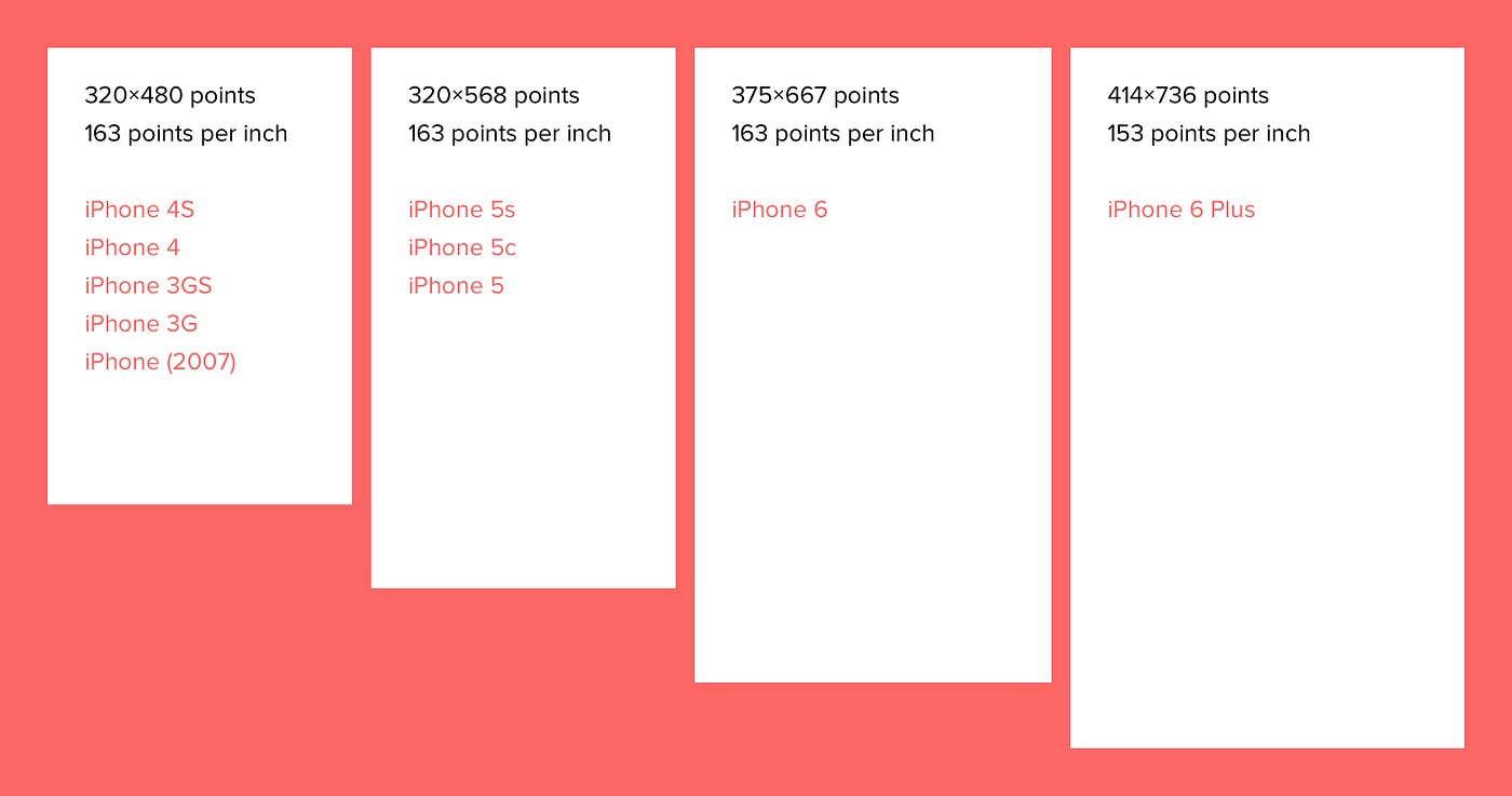
I design at iPhone 6 size (375pt x 667pt)
This is specifically for app design and website projects that need to be mobile friendly. I always design with auto-layout (Apple's fancy word for responsive layout) in mind but because I'm a designer I need a tangible size to design at. To be clear, I design at this size mainly because it is close to the halfway point between the width of the iPhone original/3G/4/5 (320pt wide) and the width of the iPhone 6+ (414pt wide). With that in mind, I can easily determine if the screen I'm designing will work for the older iPhone devices or 6+ without having to push pixels.
I design using atomic design
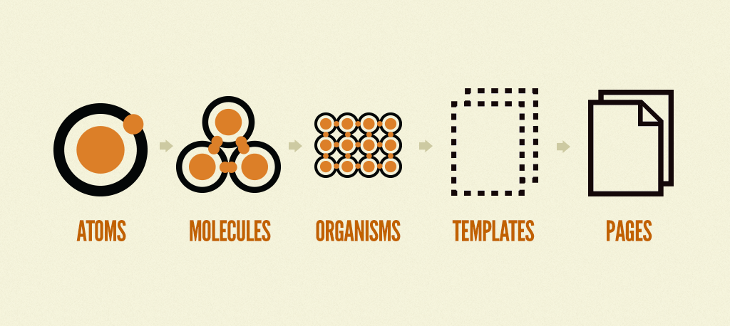
I don't know who came up with the ideology but I know Brad Frost is a major evangelist of it so go have a read of Brad's article about atomic design. I use this technique in conjunction with linked smart objects and Adobe CC libraries.
I design using linked smart objects and the new library feature
The best use of these little gems, is storing the smart object on a cloud service like Dropbox or Adobe Creative Cloud and then importing them into your document as a linked smart object. Now save this linked smart object into one of your libraries. This will now be a smart object that is linked to a cloud service. The possibilities with this are endless. The way I use them is from my style guide, I create layer effects, logo usages, buttons and so on. Now if I make a change in the style guide, it then carries through all documents that have this linked smart object. This can be an awesome feature as well as a dangerous one. So make sure the style guide is near perfect so you don't go ruining all of your awesome work.
I design using frameworks
I'm really into using Material Design right now. I call it the Gospel of Matias. If you haven't read it I suggest you do so. It's a really ambitious project by Google to bring consistency to all screens, from a watch to a 70" TV. I use it mainly for UI colours that have a high contrast with white. I'm really shit at picking colours, so this is invaluable. Their guides to everything else UI related is amazing though; read it.
Conclusion
These are just some of the ways I get shit done on a regular basis. Let me know if you have any better ways of doing things.
Like what you see? Get in touch!
Kieran Black
D&K
Bjango My App Design Workflow
Source: https://medium.com/@kieranpblack/my-app-design-workflow-39df2f3d2410
Posted by: tharpsandint.blogspot.com

0 Response to "Bjango My App Design Workflow"
Post a Comment